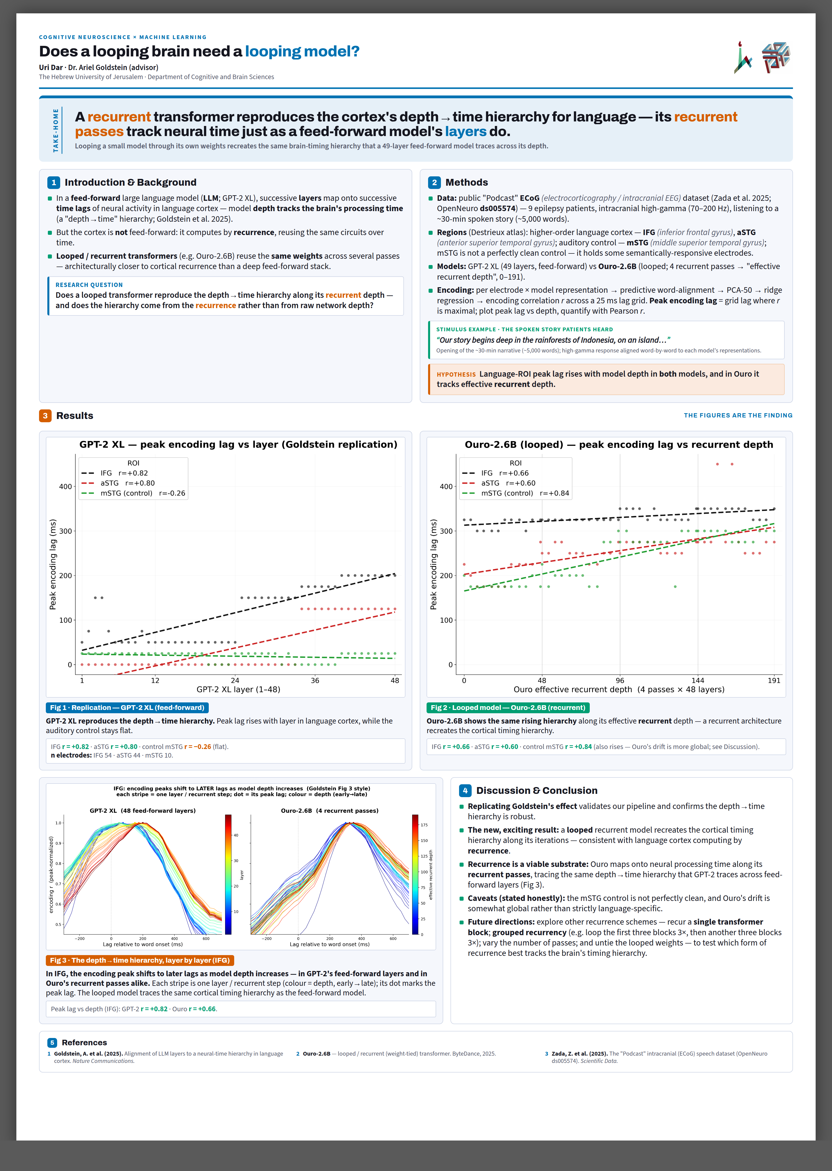
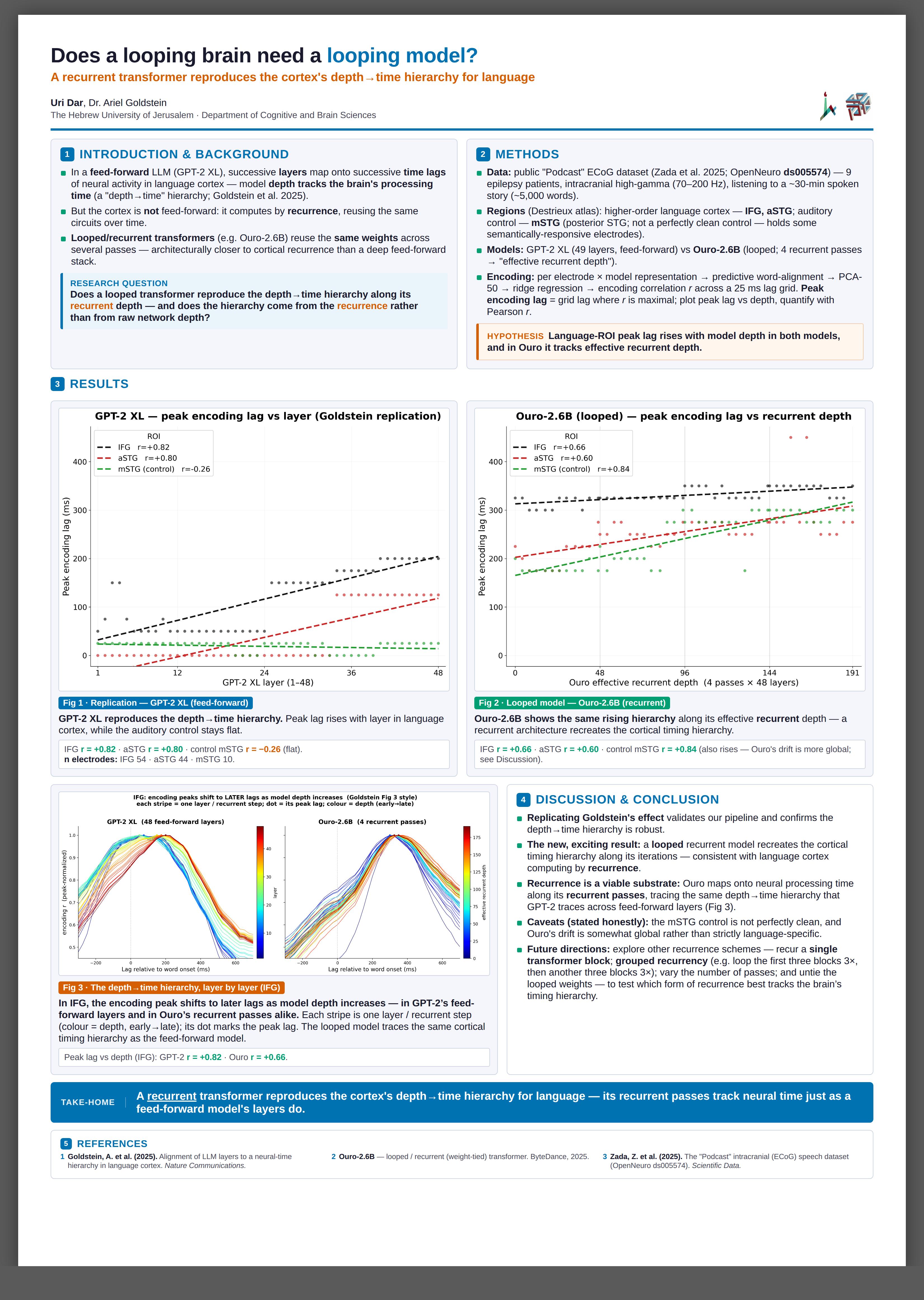
Poster redesign — 4 directions, compared
Same locked science & figures · portrait 60×85 cm · generated by 4 independent design agents,
each rendered & adversarially judged. Your frozen final poster is untouched. Tap any image to open full-res.
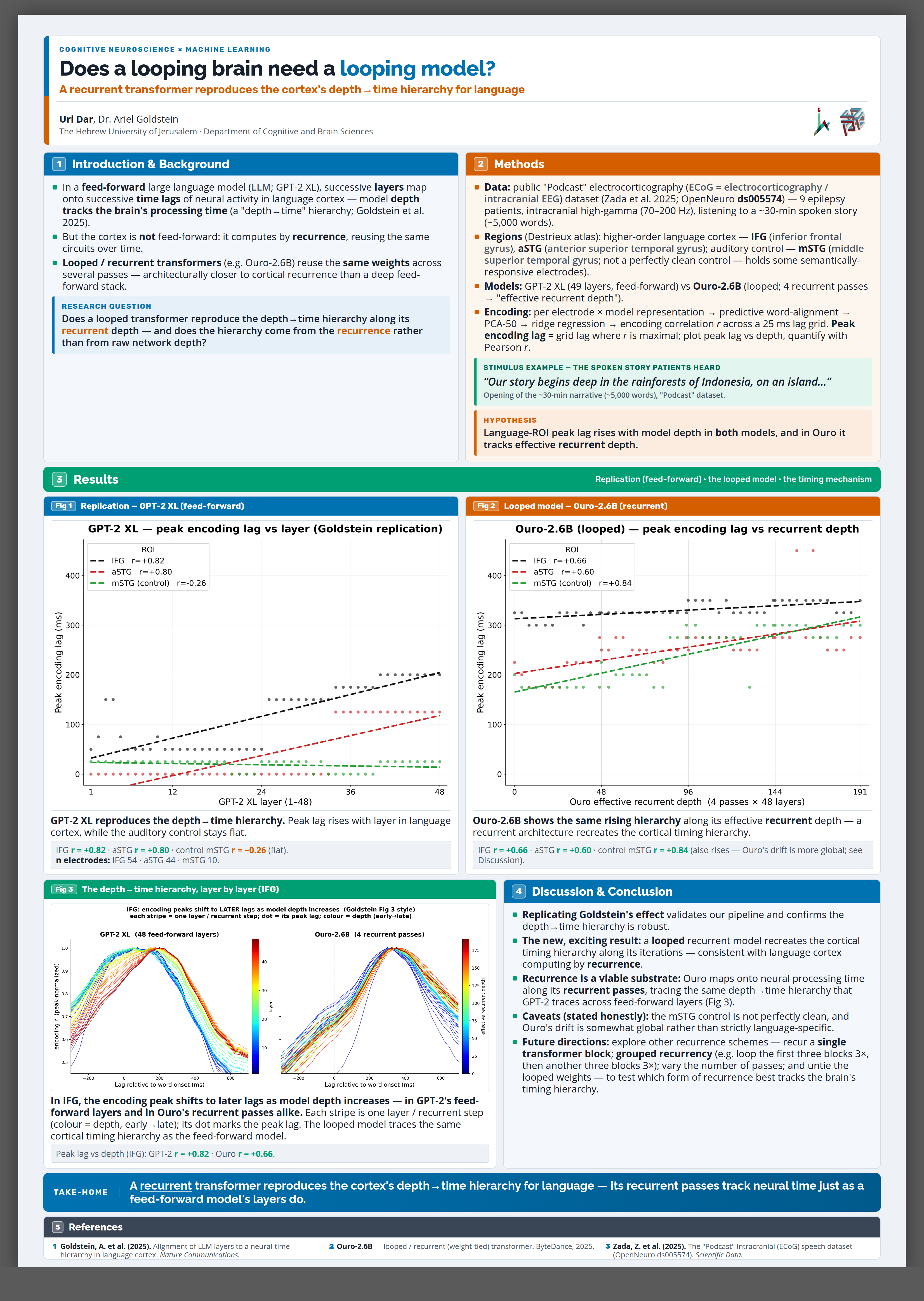
MY PICK · V3
Adopt V3 (colour-banded) as the base — it's the one that reads as a finished, stand-out
conference poster: colour ribbons orient the reader at a glance and semantically code feed-forward (blue)
vs recurrent (vermillion), figures lead Results, no dead space, top rubric score.
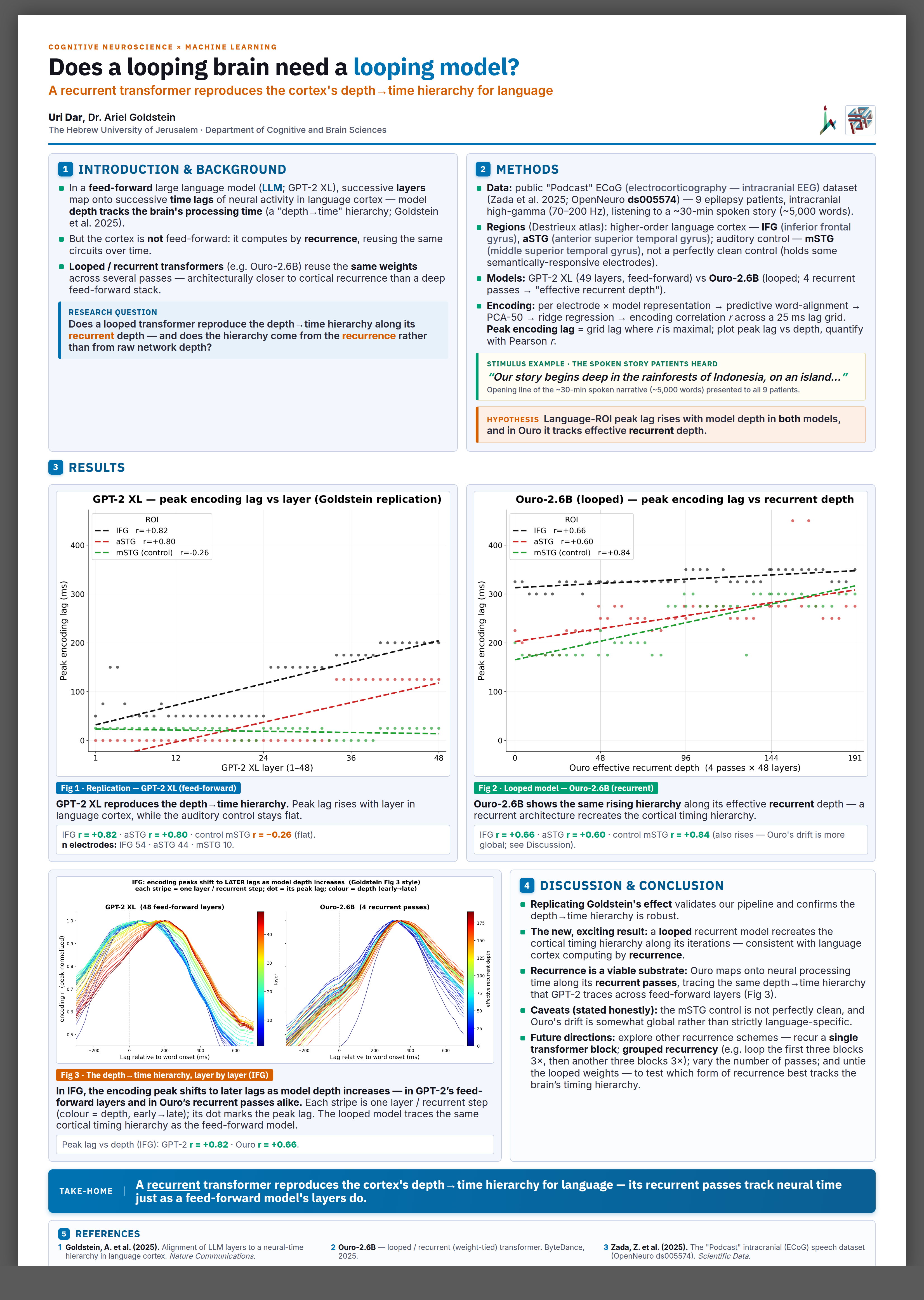
V4 (refined evolution) is the safe fallback if Ariel wants minimal change from what the lab already likes.
Before printing I'd graft 3 things into V3: ① enlarge the take-home banner toward V1's billboard scale (finding should hit from across the room), ② scale up the two header logos, ③ trim Fig 3's caption to one bold line + stats and enlarge its internal axis labels.
Before printing I'd graft 3 things into V3: ① enlarge the take-home banner toward V1's billboard scale (finding should hit from across the room), ② scale up the two header logos, ③ trim Fig 3's caption to one bold line + stats and enlarge its internal axis labels.
| # | Direction | Score | One-liner |
|---|---|---|---|
| 1 | V3 Colour-banded conference | 88 | Finished, eye-catching; ribbons give instant orientation, no structural flaws. |
| 2 | V4 Refined evolution of current | 85 | Safest, most legible upgrade of what you have; clean but quieter from across a hall. |
| 3 | V2 Editorial grid (Nature/Swiss) | 81 | Most premium/journal feel, but take-home reads as a paragraph, not a punchline. |
| 4 | V1 Billboard / big-finding | 76 | Best headline by far, but a real ~12% blank band at the bottom; needs the most rework. |
⚠ One thing to fix at the source (affects ALL versions, incl. your frozen poster):
the GPT-2 hero figure's x-axis says “layer (1–48)” / “48 feed-forward layers” while the body text
says “49 layers.” It's baked into the shared figure image, so it shows identically on every variant.
Reconcile it in the figure, not the layout (GPT-2 XL = 48 transformer blocks; the “49” likely counts the
embedding layer). Tell me which number you want and I'll fix the figure + text together.
WINNER V3 · Colour-banded conference — 88/100
Strengths
- Colour ribbons = instant 1→5 reading order at 2 m
- Blue=feed-forward / vermillion=recurrent reinforces the science
- Figures genuinely lead Results; fills the whole sheet
- Top rubric compliance; stimulus card + acronyms in place
To polish
- Take-home banner could be bigger (graft V1's scale)
- Fig 3 caption dense; internal axis labels a touch small
- Methods column slightly denser than Intro
SAFE PICK V4 · Refined evolution — 85/100
Strengths
- Highest legibility; minimal change from what the lab likes
- Crisp number badges, clean panels, professional
- Lowest-risk if Ariel wants familiarity
To polish
- Quieter — less distinctive across a crowded session
- Header logos read small from distance
#3 V2 · Editorial grid (Nature/Swiss) — 81/100
Strengths
- Most premium / authoritative typeset look
- Large figures, tight grid, lots of intentional whitespace
Weaknesses
- Take-home reads as a paragraph, not a punchline
- Can feel sparse/empty at a busy poster session
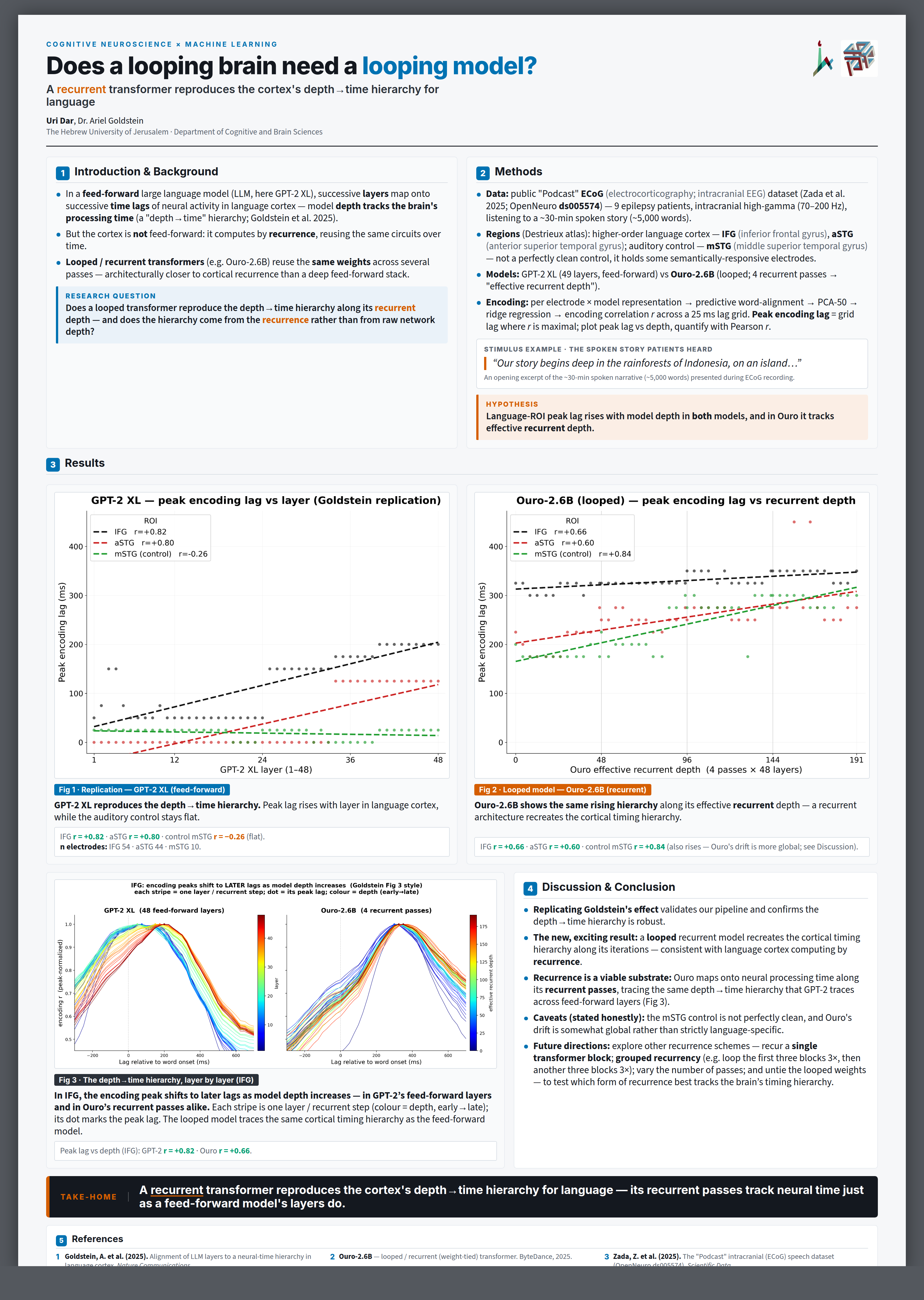
#4 V1 · Billboard / big-finding — 76/100
Strengths
- Best headline — whole story in ~10 s from 2 m
- Excellent colour discipline & typography
Weaknesses
- Real ~12% blank band across the bottom of the sheet
- Figures share Results 50/50 with text, don't dominate