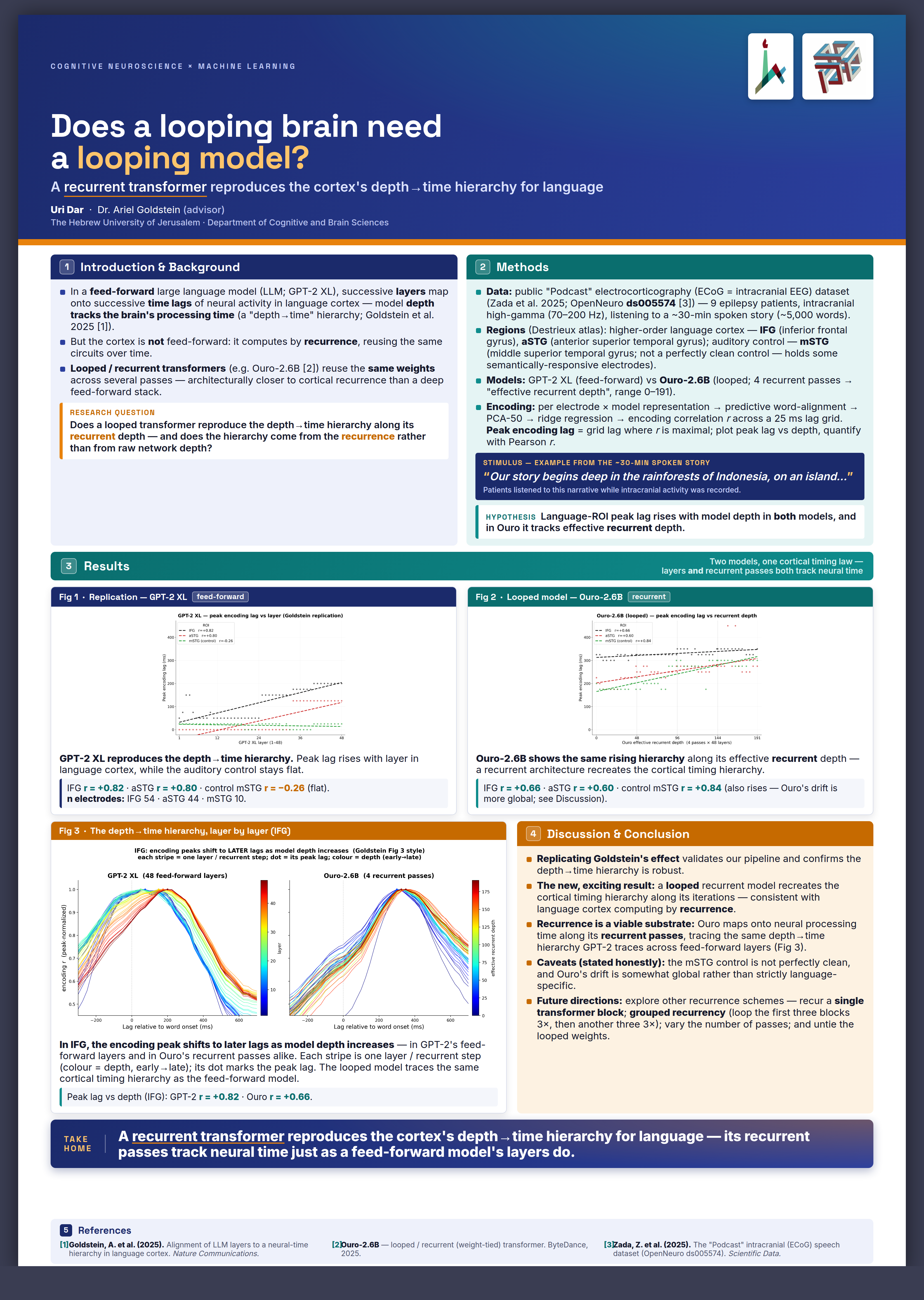
Poster — BOLD round (you said "more bold")
4 dramatic directions, much bigger departure from the white poster · bigger logos baked in ·
science/numbers/figures still locked · 60×85 cm portrait · tap any image for full-res.
Earlier (safer) set still here: pwf_redesign_compare.html
Earlier (safer) set still here: pwf_redesign_compare.html
MY PICK
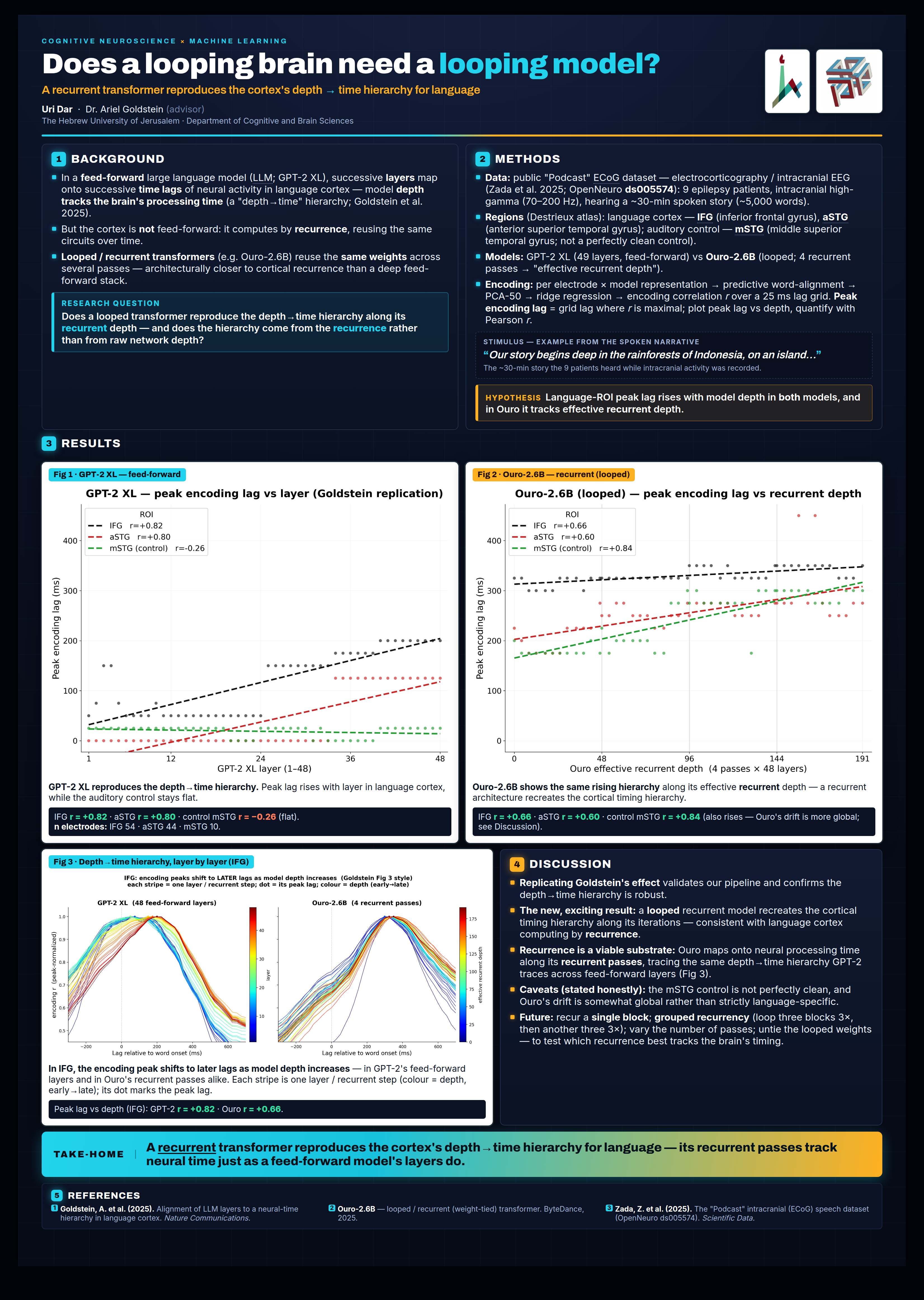
V5 Dark theatre is the boldest — a deep-navy sheet with the figures glowing on white cards; it will be the
single most eye-catching poster in the hall. The one caveat is print: a 60×85 cm mostly-dark sheet uses a lot of ink
and some large-format printers band on big dark fields. If you'd rather stay safely printable while still bold,
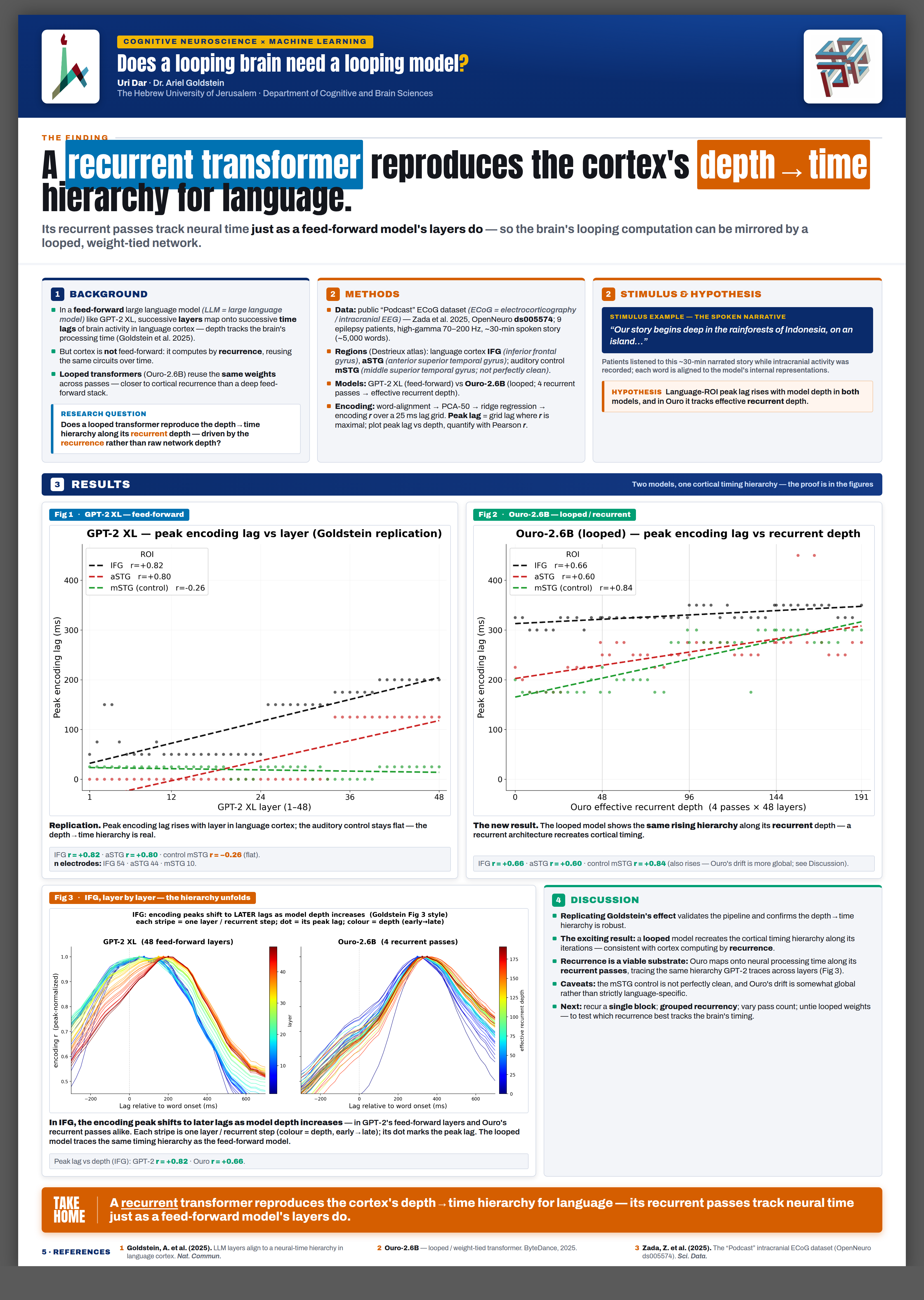
V6 Mega-billboard is the move — the finding is gigantic and readable from across the room on a mostly-white sheet.
| # | Direction | Why |
|---|---|---|
| 1 | V5 Dark theatre | Most dramatic, premium-keynote look; figures glow. ⚠ ink-heavy to print. |
| 2 | V6 Mega-billboard | Finding is huge & readable across the room; bold AND print-friendly. |
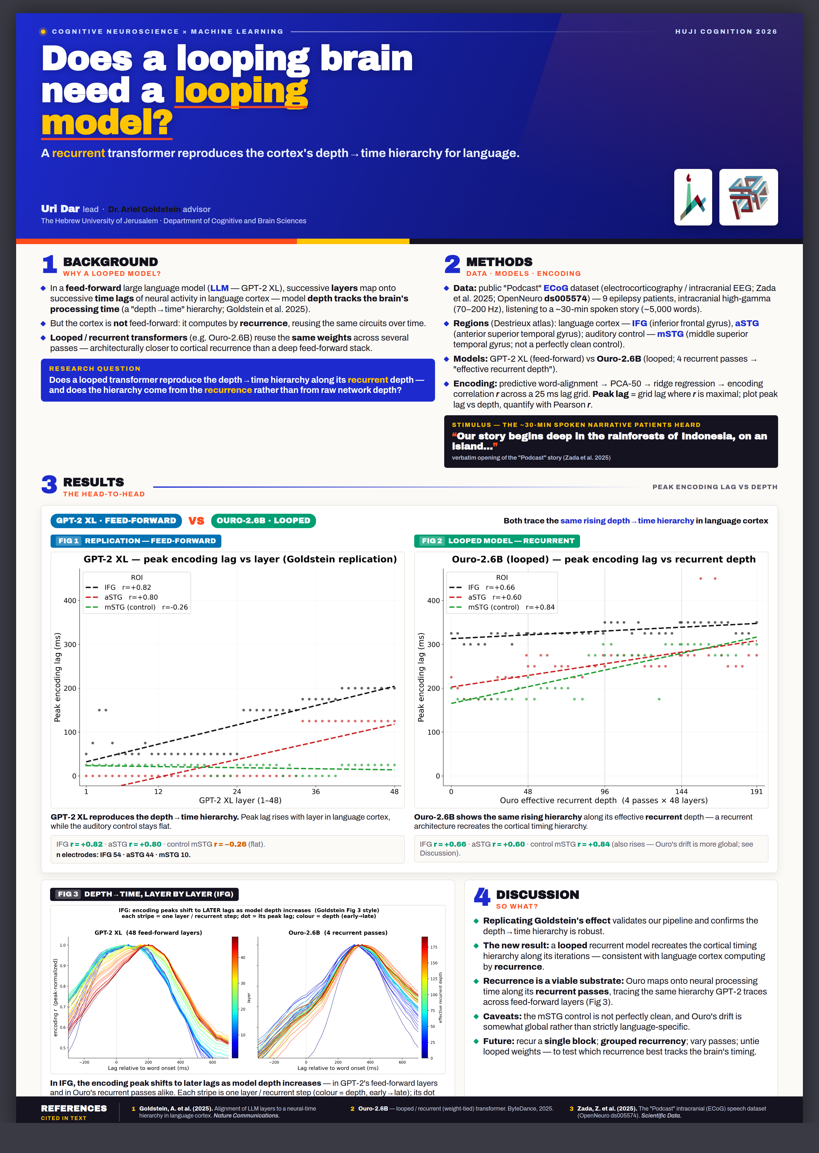
| 3 | V8 Expressive magazine | Confident big header + colour-coded section badges; clean, striking, print-friendly. |
| 4 | V7 Saturated colour-field | Bold colour header + bands, but the most restrained of the four. |
Still open (any version): the GPT-2 figure axis says "48 layers" while the text says "49 layers" — baked into
the figure image, so it's identical everywhere. Tell me which number to keep and I'll fix figure + text together when we finalize.
BOLDEST V5 · Dark theatre
Strengths
- Most eye-catching in a hall by far
- Figures pop against the dark
- Premium, modern, confident
Watch-outs
- Ink-heavy to print at 60×85 cm
- Some printers band on dark fields
SAFE-BOLD V6 · Mega-billboard
Strengths
- Result readable from across the room
- Bold but mostly white → easy to print
- No dead space
Watch-outs
- Less "designed" than V5/V8
#3 V8 · Expressive magazine
Strengths
- Strong type hierarchy & section badges
- Bold yet clean and print-friendly
Watch-outs
- Header eats some vertical space
#4 V7 · Saturated colour-field
Strengths
- Clean, confident, well-organised
- Easy to print
Watch-outs
- Most restrained — closest to the earlier round