Light + bold finals — pick one
Both built from the two you liked (V5 & V6), now light (not dark), bold,
with the body text at the advised ≥36 pt and the logos enlarged. Science/numbers/figures locked.
Earlier rounds: bold set · safe set
Earlier rounds: bold set · safe set
Both now satisfy your two notes:
- Body text bumped from ~19 pt → 36 pt (text condensed so figures dominate)
- Logos enlarged to ~5 cm, on white chips, top-right
- Also fixed: text now says "48 transformer layers" to match the figure (was "49")
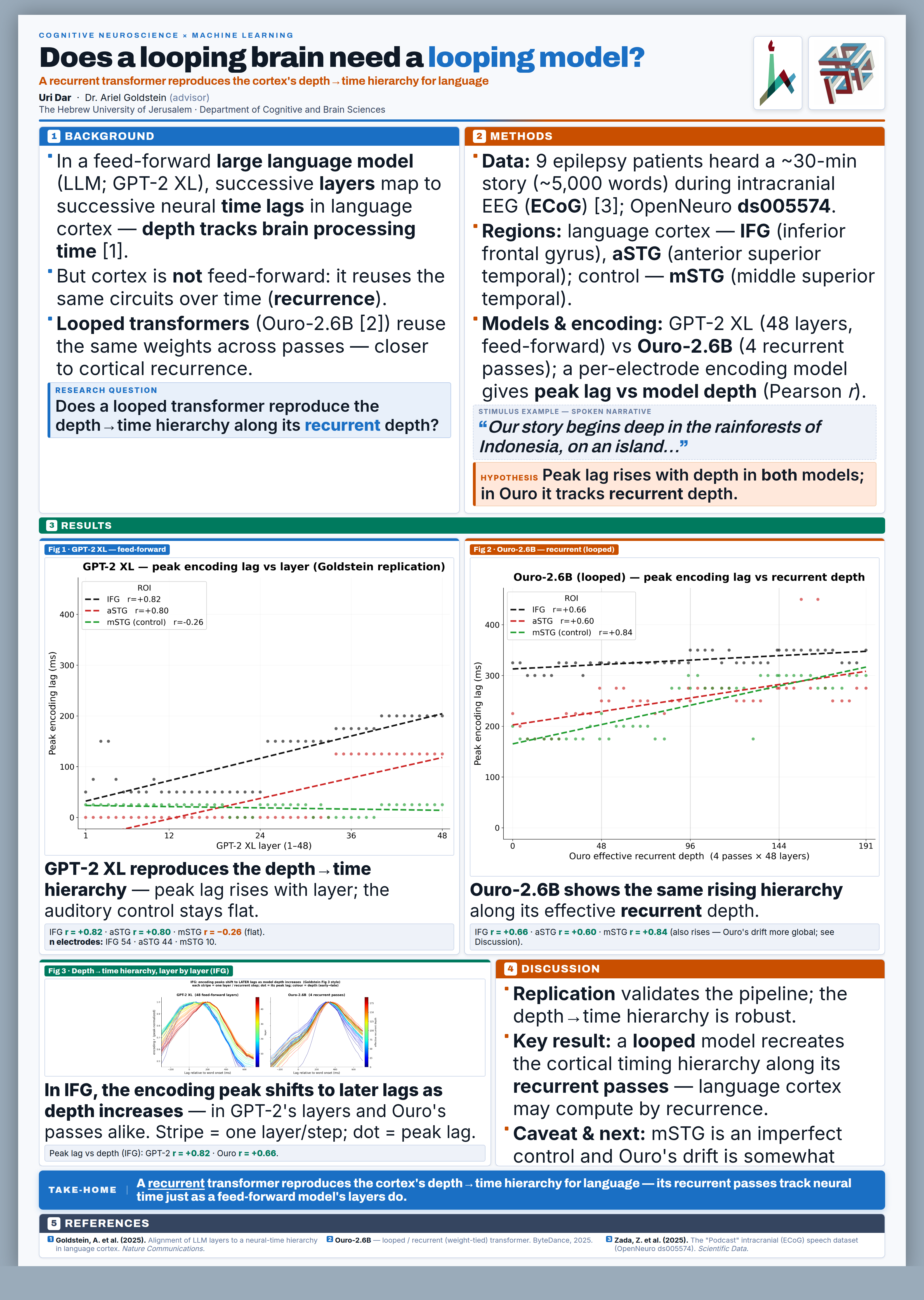
V9 Light theatre
Feel
- Bold but balanced & calm
- Figures get the most room (best "figures are the poster")
- Easiest to read top-to-bottom
Trade-off
- Headline less giant than V10
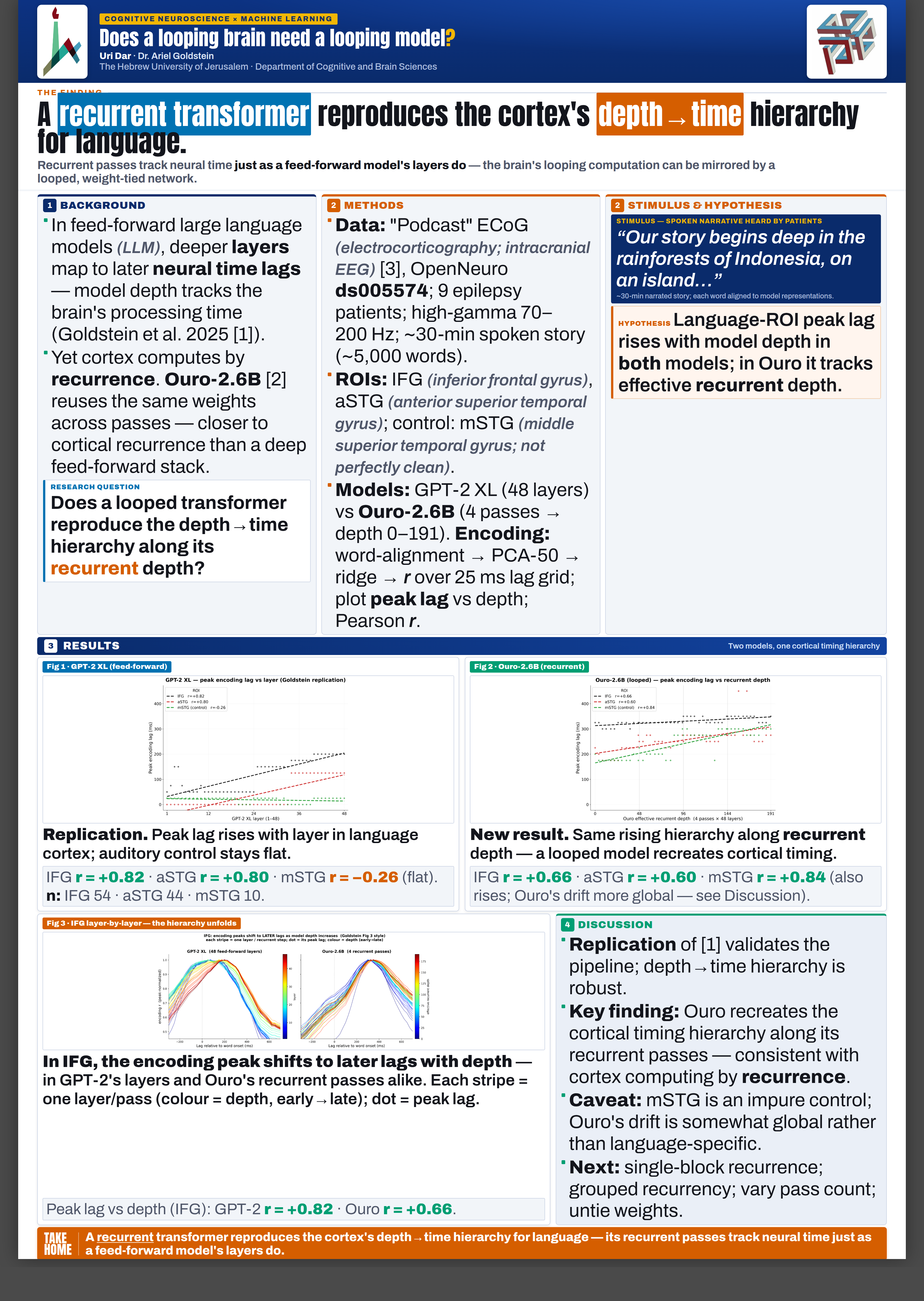
V10 Light billboard
Feel
- Maximum headline impact
- Stops people walking past
- Still light & print-friendly
Trade-off
- Figures a bit smaller (the billboard takes the top third)